UX case study

TMG Website Redesign

A before-and-after analysis of how TMG evolved from an older Wix experience into a clearer, mobile-first Wix site for students, sponsors, and event participants.

Prepared by Calvin Liew

TMG pink sheep mark
About The Marketing Group

A student-led UTSC organization and home of the Pink Sheep, TMG creates marketing events, competitions, workshops, and sponsor partnerships for students.

67% increase in total site sessions
45% growth in unique visitors
62% bounce rate reduced from baseline
3m 36s post-redesign average session duration (+30%)

Visual proof

Before vs. After

Desktop captures compare the old Wix site and the new site page by page. Each before-and-after pair uses a normalized screenshot frame so the visual differences come from the design itself, not mismatched image containers.

Homepage Impact

The redesign makes the organization identity, value proposition, and next actions visible immediately.

Visual hierarchy
Before: Wix homepage Desktop viewport
Old Wix homepage hero screenshot
After: New homepage Desktop viewport
New homepage hero screenshot

Before

The old Wix homepage has strong brand color and personality, but the centered logo stack, small navigation, social icons, oversized pink photo overlay, and About card make the first screen feel more promotional than task-oriented.

After

The new hero creates a clearer first scan: brand mark and navigation sit in one stable bar, the identity statement is large and left aligned, the mascot anchors the right side, and the two primary actions are immediately visible.

Principle

Supports recognition over recall, visual hierarchy, consistency, and Shneiderman's rule to reduce short-term memory load by placing the two main homepage actions directly in the first viewport.

About Credibility

The new design gives the mission statement its own readable content zone instead of placing it over a busy photo composition.

Information architecture
Before: Wix mission section Desktop viewport
Old Wix mission section screenshot
After: New mission section Desktop viewport
New mission section screenshot

Before

The old mission section centers a white text card over a large team photo. The message is readable, but the background competes with the copy and the team grid starts immediately below.

After

The new mission section uses a two-column layout: large heading and copy on the left, credibility image on the right. This gives the purpose statement more breathing room and a clearer reading path.

Principle

Uses figure-ground clarity, proximity, and visual hierarchy so users can distinguish mission content from supporting photography faster.

Event Discovery

The new events page uses real audience imagery and a direct invitation to make event participation feel active and student-centered.

User motivation
Before: Wix events page Desktop viewport
Old Wix events page screenshot
After: New events page Desktop viewport
New events page screenshot

Before

The old events page uses a bright pink event block and collage, which is memorable, but the first screen feels more like a static promotional banner than a clear participation path.

After

The new events page starts with a full-width audience photo, large title, and short involvement prompt. It then continues into clearer event modules, giving students both social proof and a reason to keep exploring.

Principle

Better matches the real-world student goal: quickly judge relevance, see proof that peers attend, and understand that events are opportunities to connect.

New other events section screenshot

Event Support

The new "Other Events" section expands the page beyond one flagship program. It uses a short intro, a clear event title, image proof, and practical learning outcomes so students can understand the range of programming without decoding a long archive.

Join Path

The CBA application path moves from a simple information card to a stronger campaign-style recruitment page.

Conversion path
Before: Wix CBA page Desktop viewport
Old Wix CBA applications page screenshot
After: New CBA page Desktop viewport
New CBA applications page screenshot

Before

The old Wix CBA page is fully loaded and readable, including the "What Is A CBA?" explanation. The hero still relies on a centered card over a tinted background image, and the next step is a small information button rather than a strong recruitment message.

After

The new CBA page opens with a large community photo, the "Campus Brand Ambassador" title, and a concise value line. It frames the role as identity, connection, and growth before users scroll.

Principle

Improves match with user motivation and task closure by making the application journey feel like a visible opportunity instead of a buried informational destination.

New CBA page why become a CBA section screenshot

Application Support

The new "Why Become a CBA?" section turns the role into three concrete benefits: leadership development, networking opportunities, and marketing experience. This makes the application path easier to evaluate after the hero creates interest.

Sponsor Path

The old site leaned on archive-style browsing, while the new site creates clearer audience-specific paths such as sponsorship.

Audience paths
Before: Wix archive Desktop viewport
After: New sponsors page Desktop viewport

Before

Archive browsing supports history, but it is not a direct path for students, sponsors, or applicants trying to complete a task.

After

The sponsor page turns one audience need into a dedicated page, improving clarity for external partners and making the partnership value easier to evaluate.

Principle

Supports user control and freedom by creating routes for different user intents instead of one broad archive path.

New sponsors page why sponsor TMG section screenshot

Sponsor Support

The "Why Sponsor TMG" section gives partners concrete reasons to engage: talent pipeline, brand exposure, and industry insights. Past partner logos add credibility and help sponsors recognize the opportunity faster.

Footer Paths

The new footer turns the bottom of the page into a useful navigation and contact surface instead of only a copyright and social area.

User control

Before

The old footer is compact and branded, but it mainly provides contact and social links. Users reaching the bottom have few clear routes back into core tasks.

After

The new footer adds grouped menu links, contact, address, and social destinations. It works as a recovery path for users who finish a page and need another next step.

Principle

Supports user control, recognition over recall, and Gestalt grouping by keeping major destinations visible and organizing related links into columns.

Walkthrough

New Site Journey

This walkthrough focuses only on the new website. It shows how each page supports a different user intent and how the redesign turns the site into a guided journey instead of a static brochure.

New homepage hero screenshot
1

Home

Introduces TMG, establishes the Pink Sheep identity, and gives users immediate actions: join, follow, or explore events.

New about mission section screenshot
2

About

Builds trust through the mission statement and team structure, helping students understand who runs TMG and what the group does.

New events page screenshot
3

Events

Moves users from awareness to participation by showing event value, community proof, and pathways into flagship experiences.

New sponsors page desktop screenshot
4

Sponsors

Creates a dedicated partner path, separating sponsor intent from student intent and improving clarity for external audiences.

New join page desktop screenshot
5

Join

Converts interested students into applicants by making the recruitment path feel visible, current, and action-oriented.

Design system

TMG Design System

This section documents the working visual system behind the redesigned site: brand marks, color tokens, live Wix typography, page structure, and CTA components. The button examples below show the recreated system components directly.

TMG pink sheep mark
The Marketing Group Friendly, credible, student-led, event-focused.

The brand system keeps the sheep mark and pink identity, then pairs it with navy structure and generous whitespace. The result feels more like a student organization platform than a one-off promotional page.

Community Professional Approachable Event-led

Colors

Pink is reserved for brand emphasis and positive energy. Navy carries navigation, headings, and high-contrast actions. Neutral surfaces keep image-heavy pages readable.

Brand Pink#FA3C78
Deep Pink#C72572
Navigation Navy#172231
Body Ink#20222A
Soft Surface#F7F8FB
Divider Line#E7E9EF

Typography

The source repo lists Inter as its build font, but the live Wix pages render the visible system with Raleway for major headings and CTAs, plus Wix Madefor Text for body/supporting copy. The case study follows that live rendering.

DisplayRaleway Bold / 56-90px
REVIVE 2027
SectionRaleway Bold / 32-48px
Our events
BodyWix Madefor Text / 16-20px
Clear paragraphs explain the value of each event without forcing users to decode dense promotional copy.

Layout

The system uses repeatable measurements so Wix sections feel related across Home, About, Events, Sponsors, and Join paths.

Max width1180px content wrapper
Radius8px cards, pill CTAs
Section gap58px desktop rhythm
MobileSingle-column scan path
Page pattern Each main route opens with a high-signal hero, moves into proof or grouped details, and closes with an action. That pattern makes Home, About, Events, Sponsors, and Join feel related even when each page has its own imagery.

Navigation

A white pill-shaped nav separates the brand from the page background, while the dark CTA gives the user a persistent next step.

CTAs

Primary actions use navy fill and high contrast. Secondary actions stay visible but quieter, supporting Shneiderman's consistency rule and Fitts's Law.

Event Module

Event pages follow the same pattern: title, plain-language value statement, proof image, supporting details, and a clear conversion route.

CTA component library

Button System

The CTA system uses pill geometry, generous horizontal padding, bold Raleway labels, and strong contrast. Each example below is a cleaned-up component treatment based on the redesigned Wix site.

Hero CTA pair

Primary membership action sits beside a darker social action, giving users two clear next steps from the homepage.

Event card action

The compact navy pill anchors event cards and uses the arrow to signal forward movement.

Recruitment pair

The white social CTA and gradient application CTA keep the page energetic while still following the same pill geometry.

Utility link

The compact navy pill gives external destinations a consistent treatment without competing with major page actions.

Page logic

Redesign Logic

Each page was redesigned to support a specific user goal. The talking points below connect visible design choices to concrete HCI principles.

About: Build Trust

  • Credibility cues: Team photography and role labels help users understand that TMG is active, staffed, and organized.
  • Gestalt grouping: Members are grouped by functional area, reducing the work needed to understand team structure.
  • Reduced cognitive load: Mission, leadership, and departments are separated into smaller chunks instead of one broad content block.
  • Match with user goals: Prospective members can quickly understand who runs the group and where they might fit.
Gestalt proximity Cognitive load Trust signals

Events: Drive Participation

  • Real-world match: The page speaks to student motivations: networking, competitions, workshops, and professional exposure.
  • Visual storytelling: Event photography shows participation and community, making the offer more concrete.
  • Action closure: CTAs and social links give users a next step after learning about events.
  • Scanning efficiency: Headings and concise copy make event value easier to understand without reading a long archive.
Nielsen: real world Shneiderman: closure Scanning

Sponsors: Segment Intent

  • Information architecture (IA): Sponsors get a dedicated path instead of being buried inside general club content.
  • Hick's Law: Separating sponsor intent from student intent reduces decision complexity for different audiences.
  • Value proposition: The page frames why partners should collaborate with TMG before asking them to act.
  • User control: Sponsors can reach the relevant path directly from navigation and footer links.
Hick's Law Information architecture User control

Join: Convert Interest

  • Conversion clarity: The recruitment page gives interested students a focused path instead of making them infer how to get involved.
  • Error prevention: Clear labels and page framing reduce uncertainty about whether the user is in the right place.
  • Motivational design: The page positions joining as a meaningful student opportunity, not just an administrative form.
  • Mobile-first action: Application messaging remains readable and accessible on smaller screens.
Conversion UX Error prevention Mobile-first

UI examples

Key UI Moments

A curated set of interface moments that show how the redesign turns people, events, sponsorship, and conversion paths into a consistent experience.

People Proof Team and leadership become easier to trust.
Event Discovery Programs become easier to compare and enter.
Sponsor Path Partner value is framed before the ask.
System Reuse Cards, CTAs, and page rhythm repeat cleanly.

UI choices

Design Choices

The redesign works because it standardizes the visual language while allowing each page to have a clear purpose. These are the main UI decisions behind that system.

Color

Pink remains the core brand signal, while navy anchors navigation, CTAs, and footer content. White space keeps the palette from becoming overwhelming.

Typography

Raleway carries the high-impact headings and CTA labels, while Wix Madefor Text handles readable body and supporting copy. Inter remains documented as the source-repo font, but the case study follows the live Wix rendering.

Cards

Events, team members, sponsors, and responsive examples use repeated card patterns. This creates consistency and reduces learning effort.

Photography

Real event and team imagery replaces generic brochure feeling with credibility, social proof, and a clearer sense of community.

CTA Hierarchy

Primary actions use stronger contrast and clearer verbs. Secondary actions remain visible without competing with the main conversion path.

Spacing

More deliberate spacing separates page sections, helping users distinguish between awareness, exploration, trust-building, and conversion areas.

Navigation

Navigation is organized by user intent: about the organization, events, sponsors, and joining. This supports both exploration and direct task completion.

Responsive Layout

Tablet and mobile layouts preserve reading order, stack complex sections, and keep important actions reachable without horizontal scanning.

Page Personality

Each event page can use a distinct tone and imagery while still fitting the broader TMG system, making the site feel active rather than templated.

Responsive

Responsive Views

These captures focus only on the new site. They show how the redesign adapts across the main user paths without relying on the old site's fixed template behavior.

HCI review

Design Principles

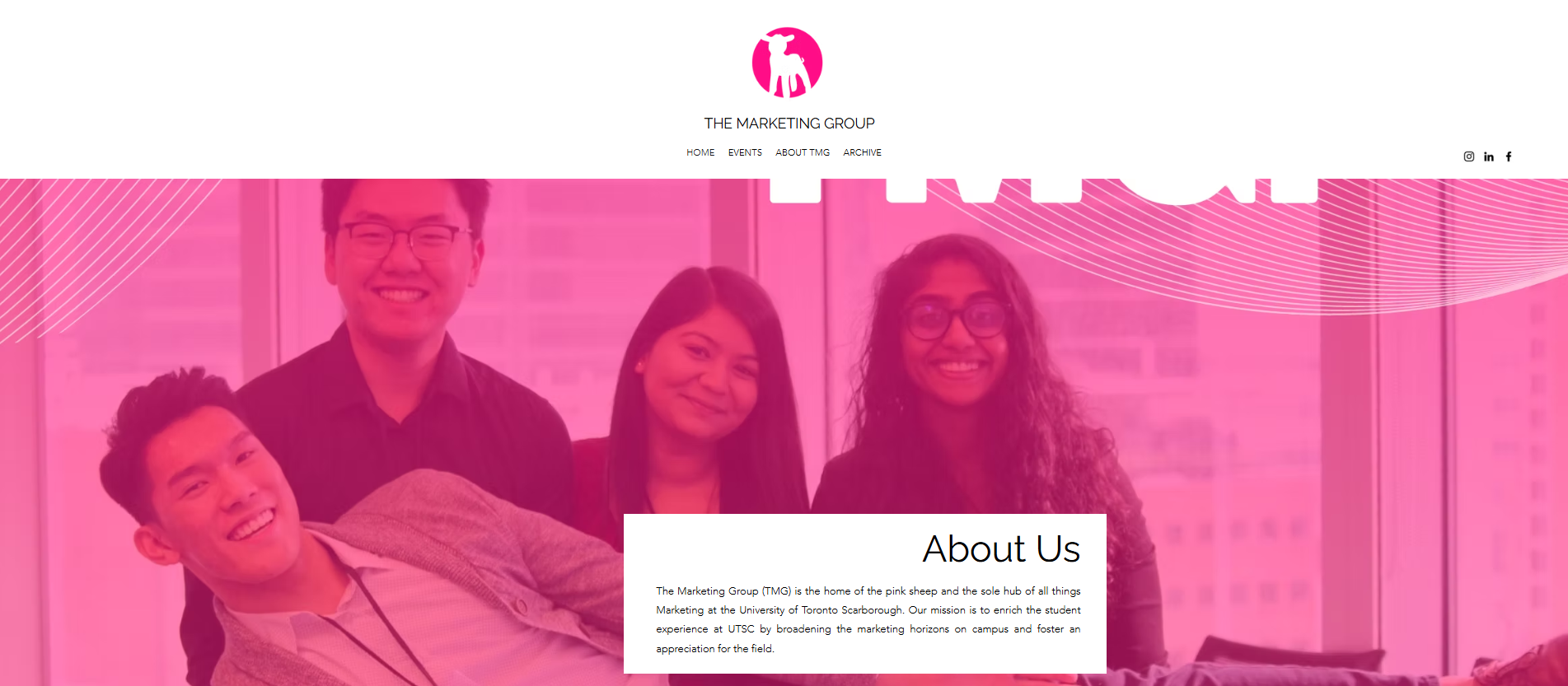
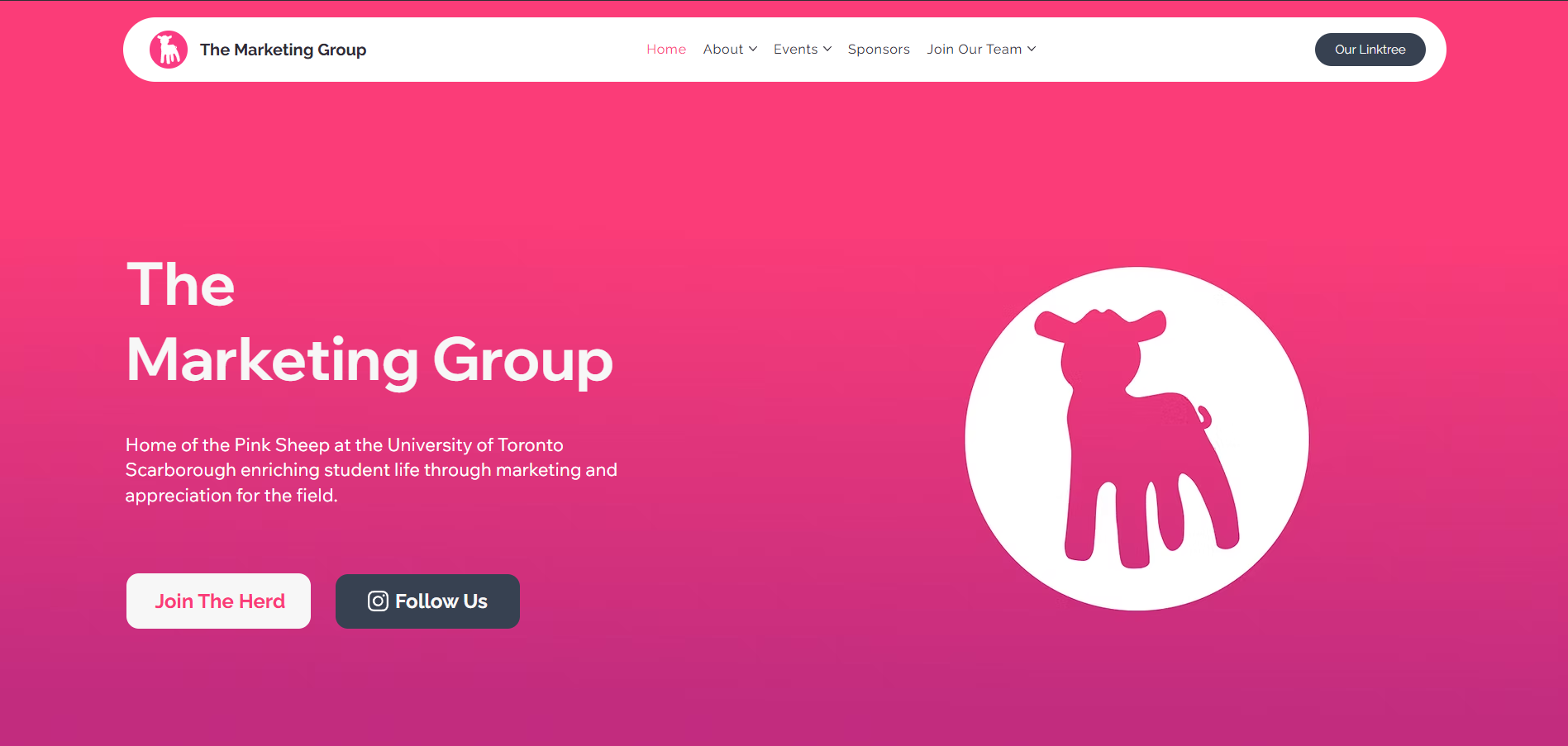
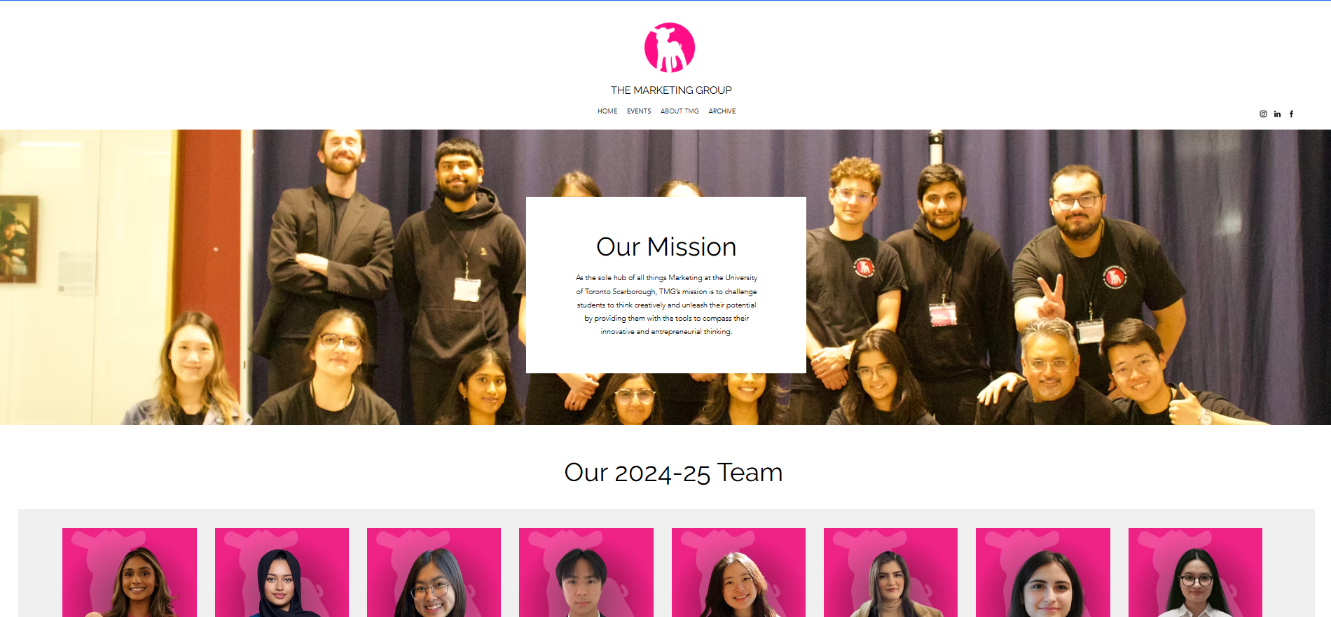
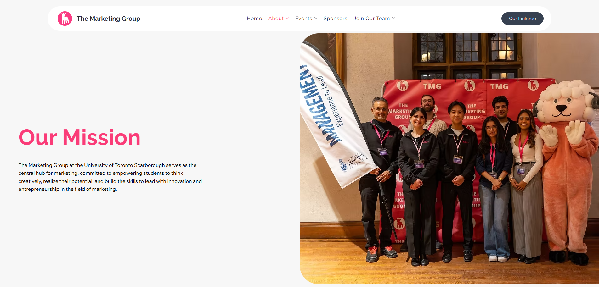
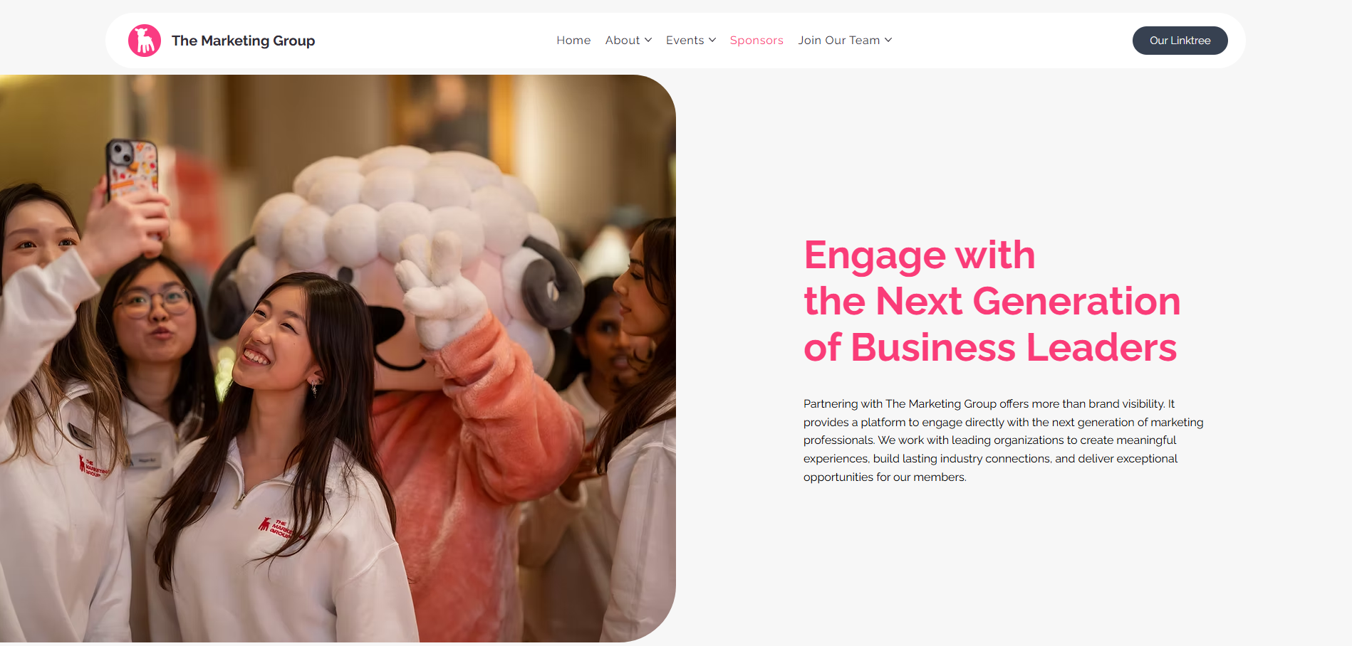
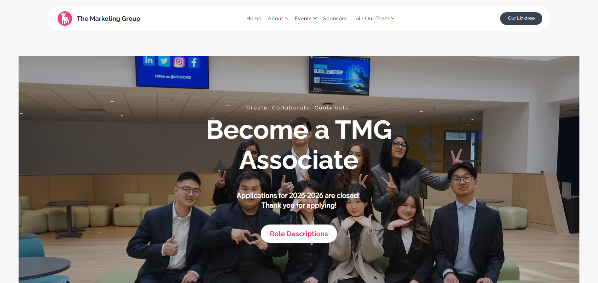
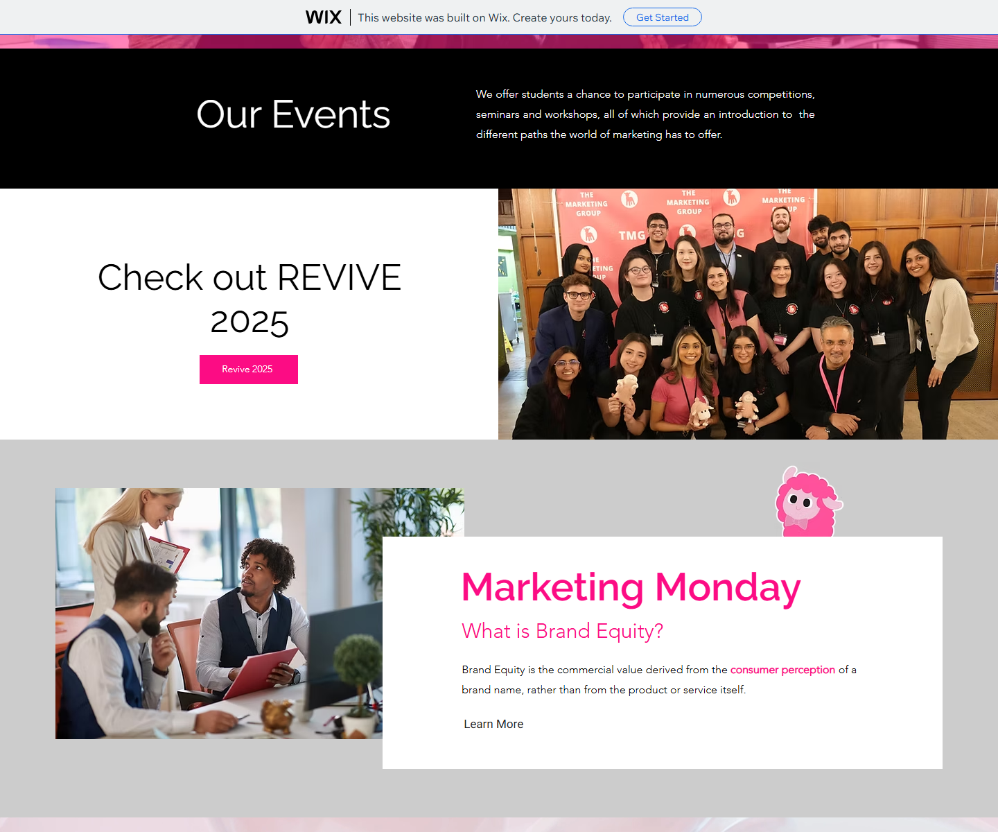
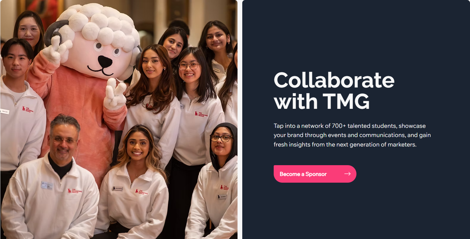
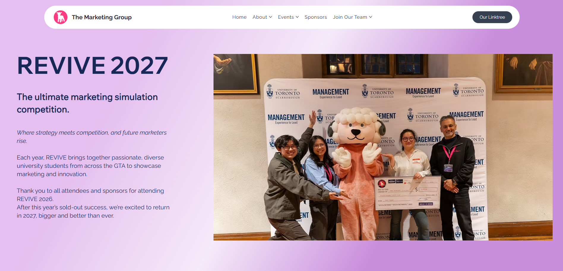
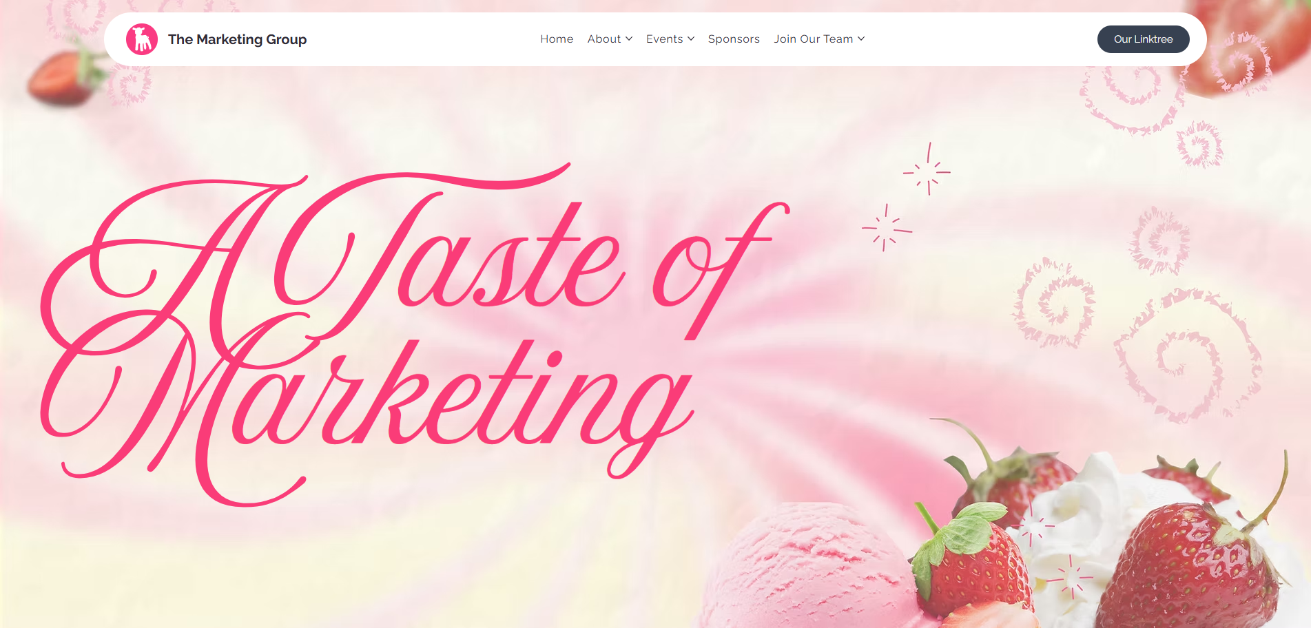
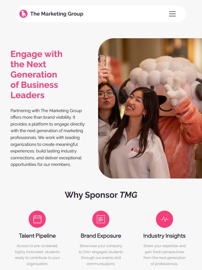
The redesign is strongest when framed as an HCI improvement, not only a visual refresh. The site now gives users clearer paths, better orientation, and less work to understand what to do next.

Recognition over Recall

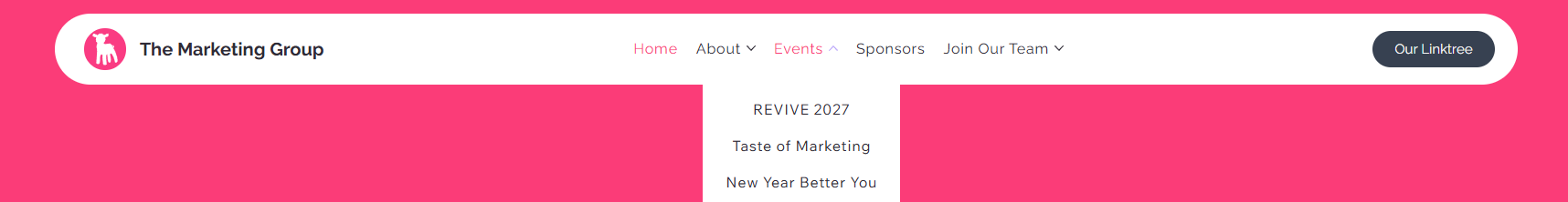
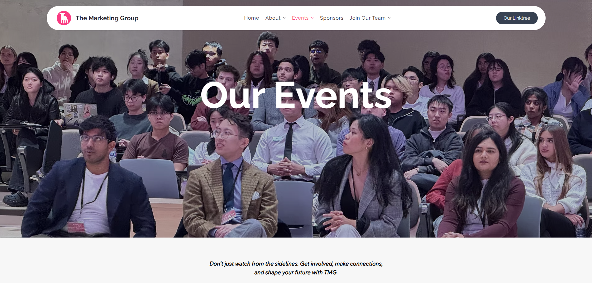
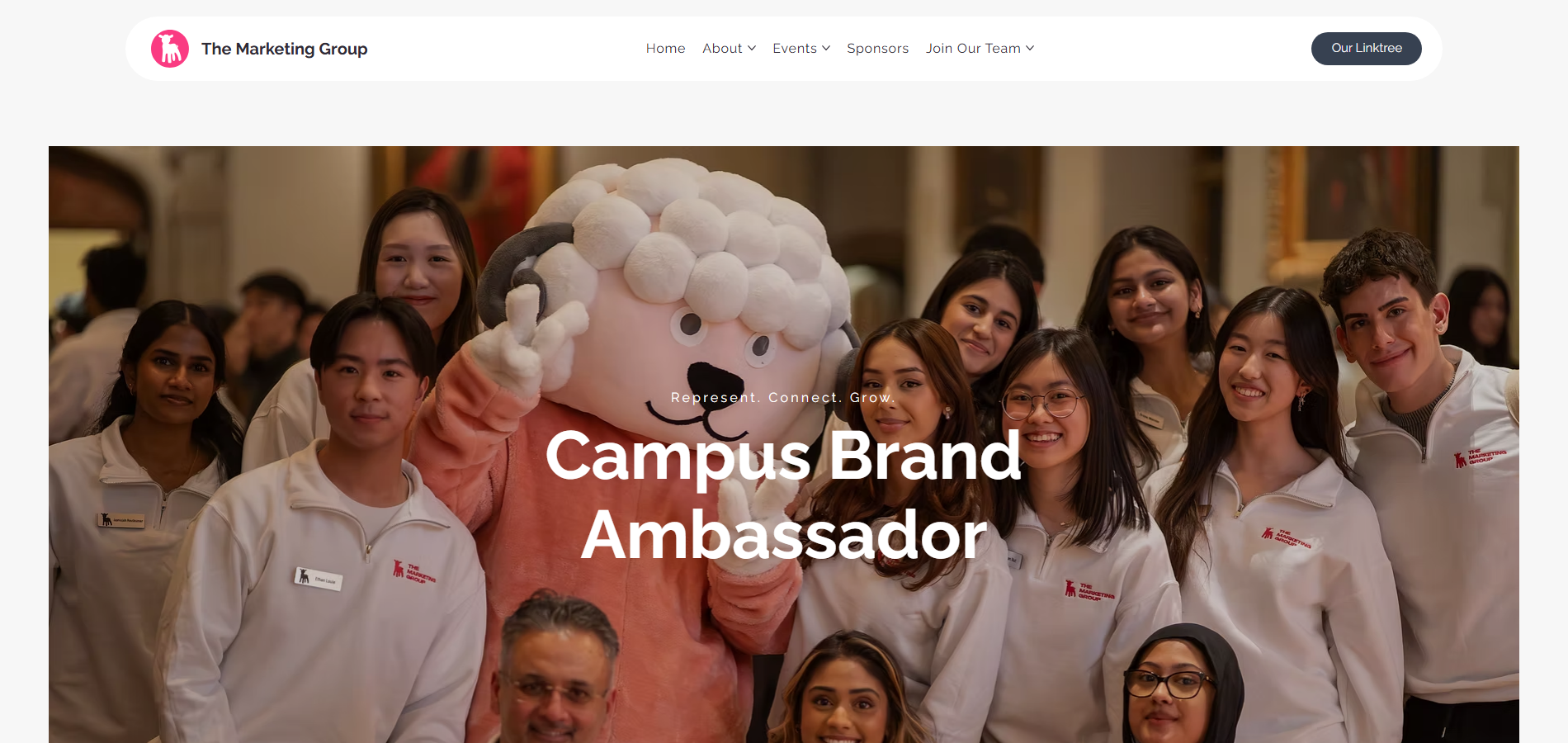
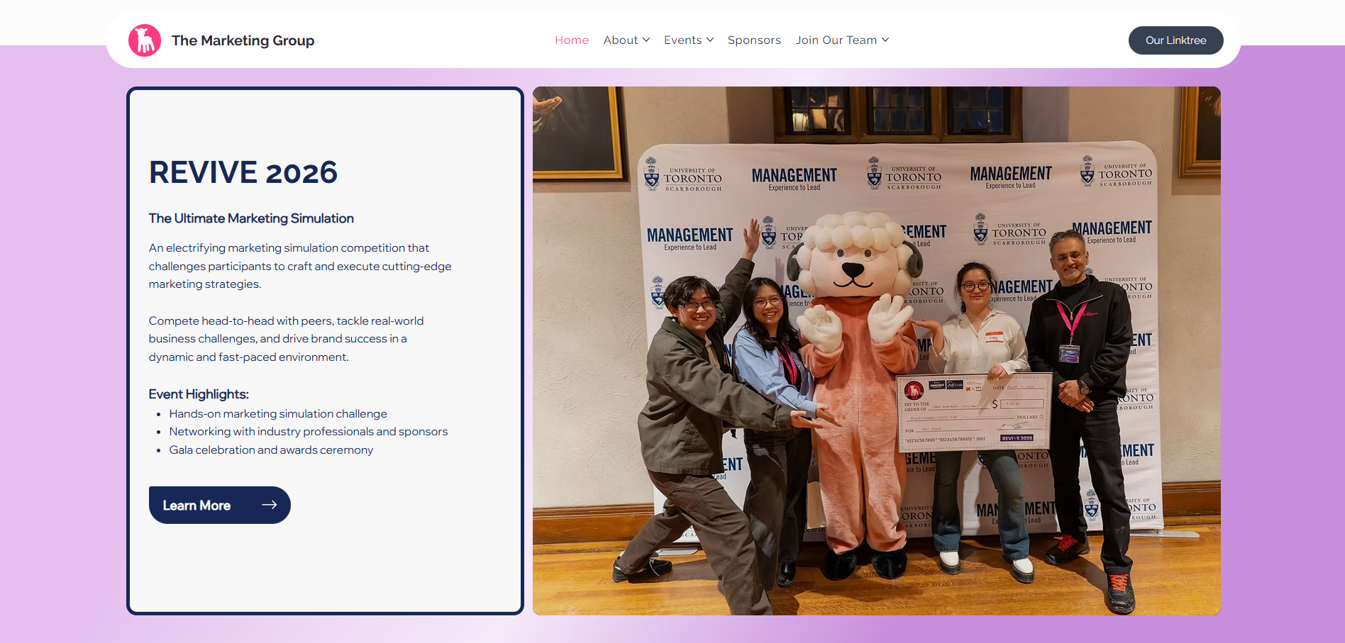
Navigation, event sections, and CTAs expose the main choices instead of making users hunt for them.

Consistency

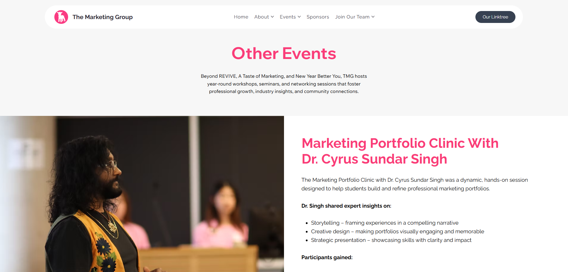
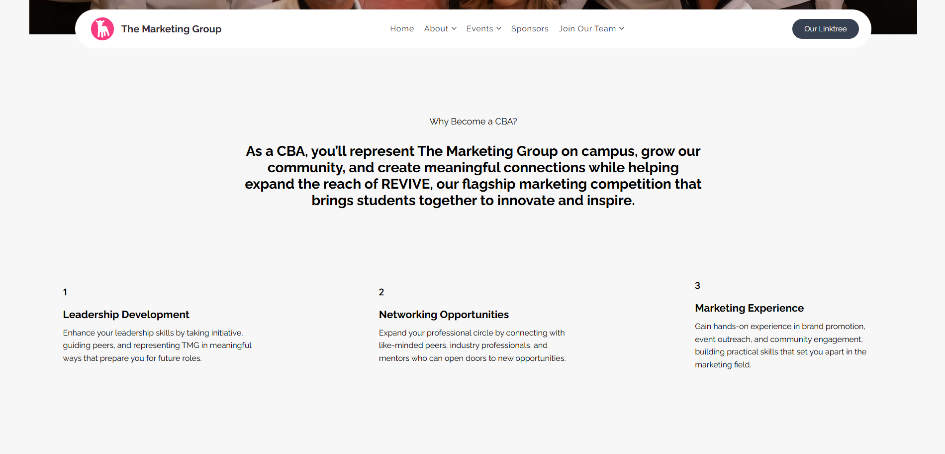
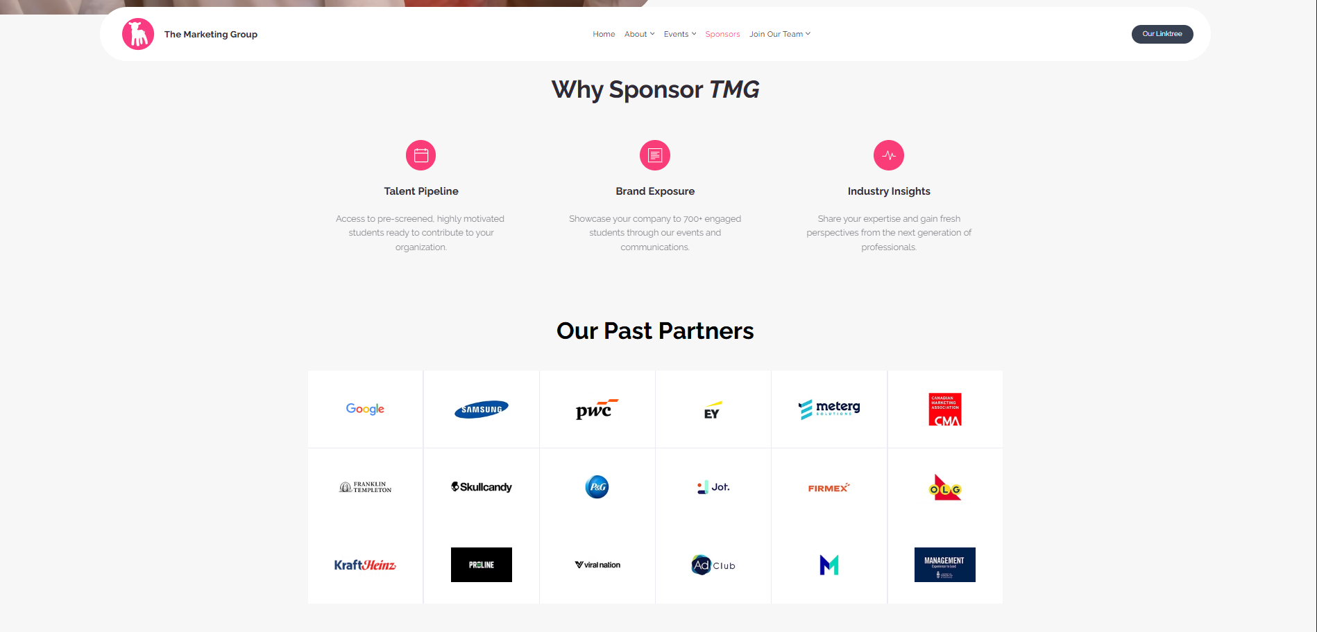
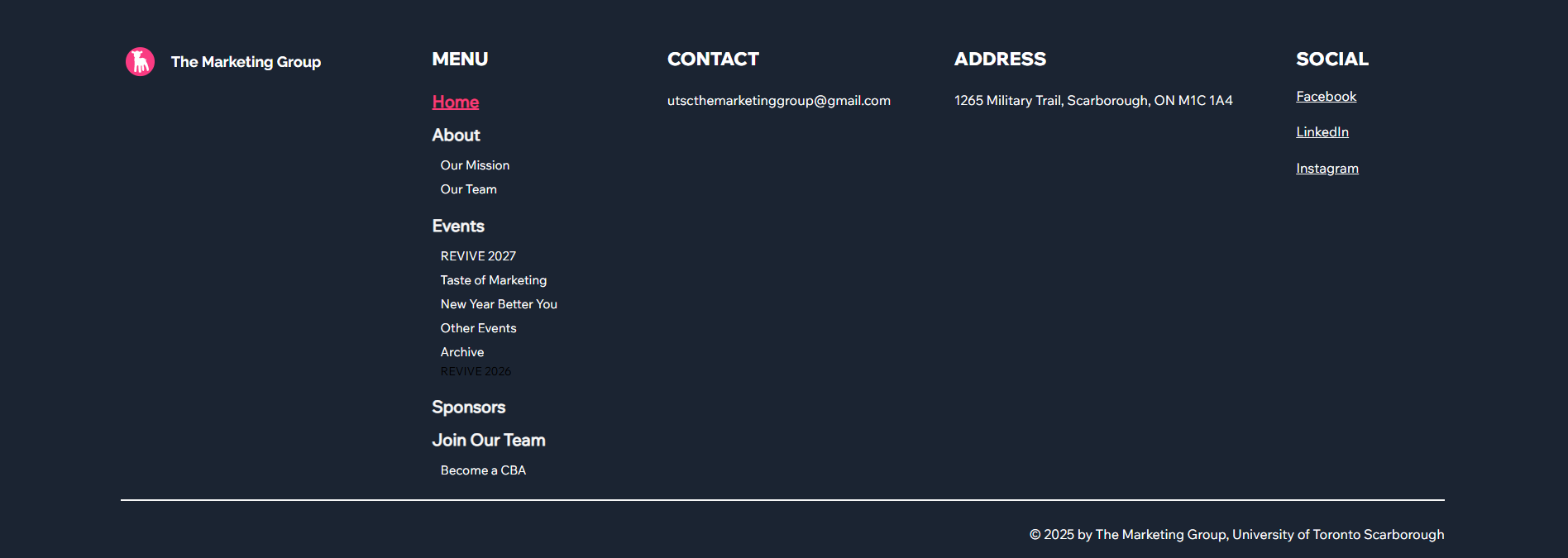
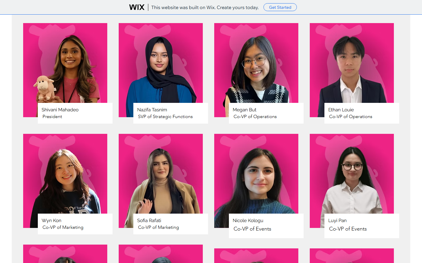
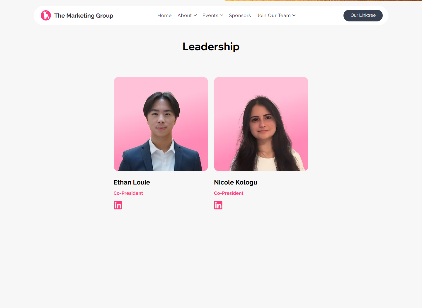
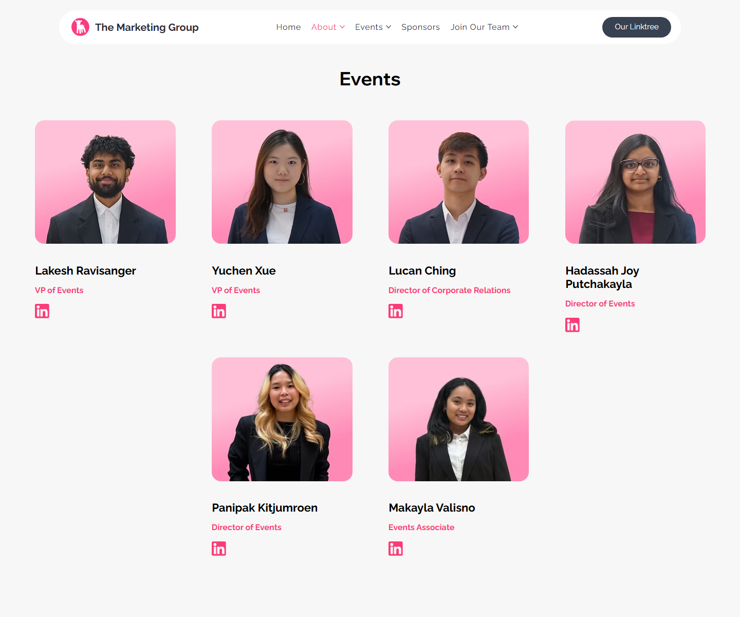
Repeated cards, buttons, headings, and footer links make the site easier to learn as users move through it.

Fitts's Law

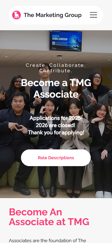
Large, high-contrast CTAs on desktop and mobile make the most important actions easier to target.

Gestalt Grouping

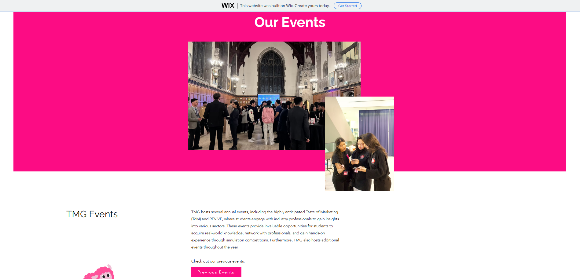
Related content is grouped into event cards, team sections, navigation categories, and footer columns.

Hick's Law

Top-level navigation separates About, Events, Sponsors, and Join, reducing decision complexity for different user types.

Match the Real World

Copy and page paths match student goals: discover events, understand the team, follow TMG, sponsor, or apply.

User Control

Persistent navigation, footer links, and repeated CTAs give users multiple ways to continue or recover.
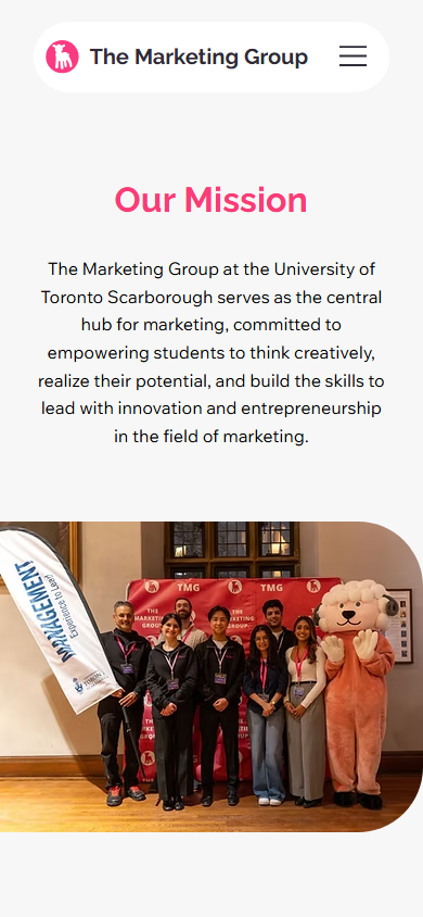
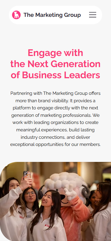
Mobile-First

The layout collapses into clear single-column flows so key information stays readable on student phone screens.

Applied choices

Principles in Practice

The UX work was not only about making pages look modern. Each major design choice maps to a concrete usability problem from the old site.

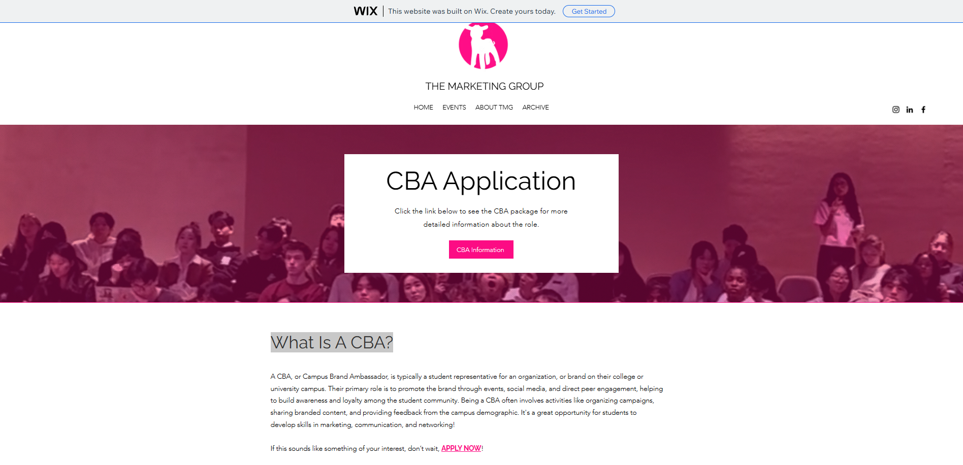
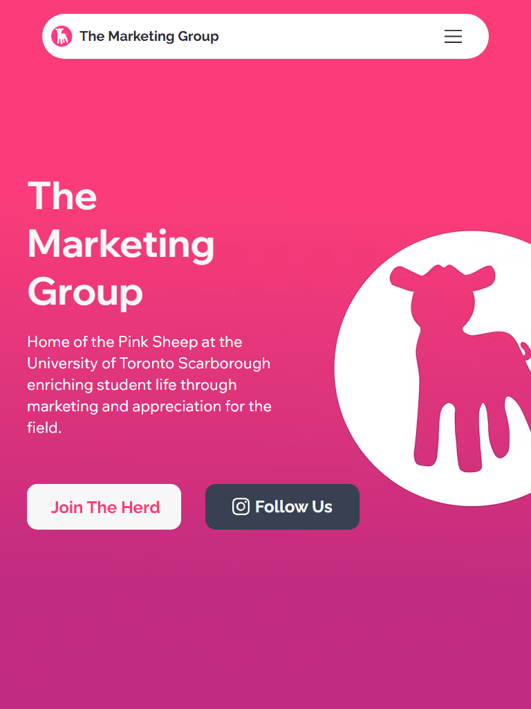
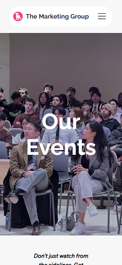
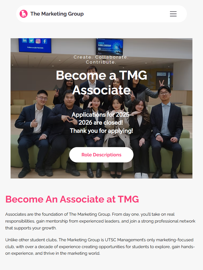
Problem: unclear next action Solution: visible hero CTAs, repeated event CTAs, sponsor CTA, and Join Our Team route.
Problem: weak mobile journey Solution: compact mobile header, stacked sections, readable copy, and phone-friendly buttons.
Problem: shallow navigation Solution: audience-based information architecture (IA) for students, event attendees, applicants, sponsors, and social visitors.
Problem: high cognitive load Solution: consistent cards, clearer section headings, smaller content chunks, and grouped team roles.
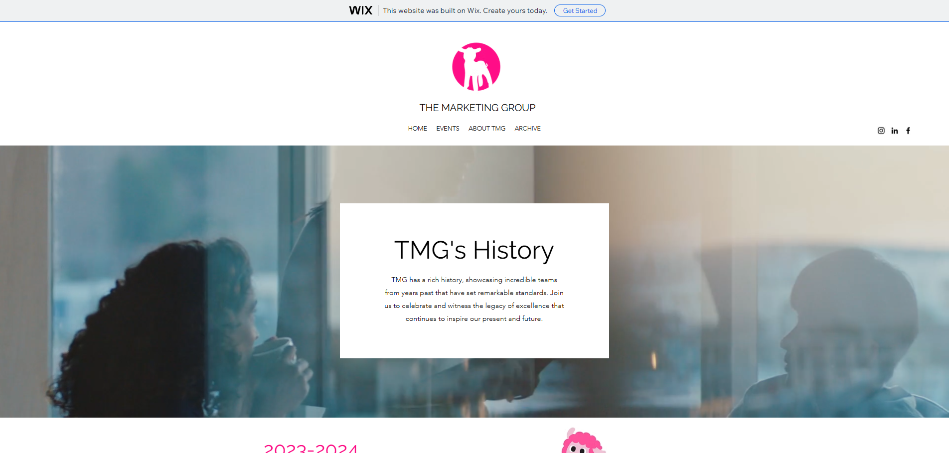
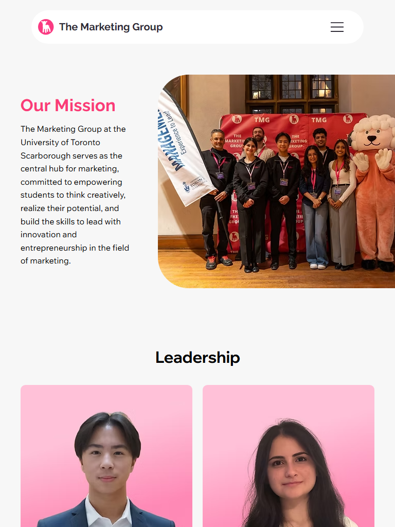
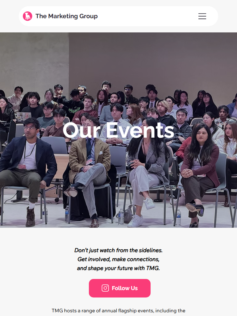
Problem: limited credibility cues Solution: stronger photography, team visibility, sponsor pathway, event imagery, and consistent brand system.
Problem: poor scanning Solution: stronger contrast, larger headings, predictable layout rhythm, and visual hierarchy.

Conclusion

Brochure to Action

The redesign makes TMG easier to understand, easier to navigate, and easier to act on. The improved experience supports event discovery, recruitment, social engagement, and sponsor credibility.

Mobile-first layout: The new site supports the student audience's likely phone-first browsing behavior.
Clearer information architecture (IA): About, events, sponsorship, and joining paths are visible as distinct user goals.
Stronger conversion cues: CTAs appear at moments where users have enough context to act.